16 weeks later - what do I do now?
It has been an intersting experience. I've met some great people, had a few laughs, drunk a few beers - some good - some not so, learnt how to blog and almost by osmosis developed a range of skills around photography that I did not have before.
All I wanted to do was learn a bit about digital photogrphy having been sqaurely in the film camp until last summer.
If you thought developing film was expensive wait 'till you get hooked on digital. Hello, my name is Ian and I think I might be becoming an addict.
I'll just get a digital camera -
I need to go on a course to learn how to use it better -
I find I cannot wait for my PC to keep up as I try to compare images - I need a new computer - oh and by the way don't forget I need new screen and screen calibrator because the one I have does not compare to those used at college.
(and my wife's viewpoint - "well, photo geek boy, at least it's not another woman. If you think i'm coming out with you when you are carrying a tripod you've got another thing coming.")
Hello, my name is Ian and I think I might be becoming an addict.
16 weeks - I need another fix.
YES - I've found a new supplier -
Derby City Photographic Club my first visit - 31st January and a visiting speaker - JOHN WELLS FRPS - THE JOHNNY WELLS ROADSHOW http://www.johnswells.co.uk/
Nerves steadied, fix achieved,
hello, my name is Ian and I think I might be becoming an addict.
Next fix 7th Feb -
Will Cheung FRPS - My Passion for Photography
"A presentation by one of the most respected names in the world of photographic magazines. In the last 25 years, Will has been Editor of Photography Monthly, Digital Photo, Photography Monthly and, now, Advanced Photographer. "
Hello, my name is Ian and I think I might be becoming an addict.
Sunday, 6 February 2011

Wednesday, 26 January 2011
Final Choice
Final choice for presentation
I have chosen to present my final images printed on 350g coated paper, displayed in a hard backed display book. Many people have taken an interest in the work that I have undertaken during this course and this form of presentation will enable me to take the images and show individuals what has been achieved, ensuring that each will see the image as I want it to be seen. Display on this blog is cost effective and can be seen easily, however, I have no control over the final colour that will be seen. Having taken the effort to calibrate my screen; spend hours capturing images; attending college and finalising the images I want that final element of control.
The images here are saved as sRGB JPEG's, the colour gamut is that used with most photographs. The prints have been printed using a four colour CYMK process - there will be differences in the end results. I have been most pleased with the effect that it has on the black & white images.
Final Images
Theme 1 - Built environment, South Derbyshire.


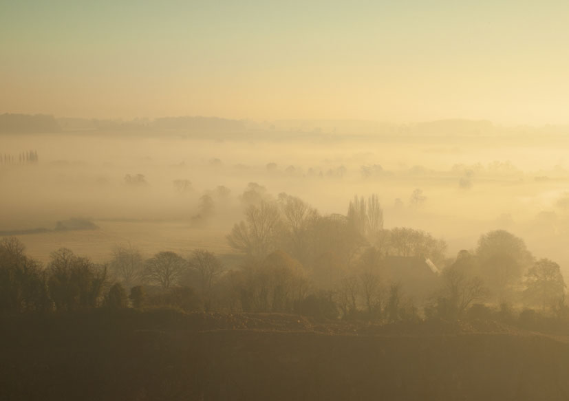


I have chosen to present my final images printed on 350g coated paper, displayed in a hard backed display book. Many people have taken an interest in the work that I have undertaken during this course and this form of presentation will enable me to take the images and show individuals what has been achieved, ensuring that each will see the image as I want it to be seen. Display on this blog is cost effective and can be seen easily, however, I have no control over the final colour that will be seen. Having taken the effort to calibrate my screen; spend hours capturing images; attending college and finalising the images I want that final element of control.
The images here are saved as sRGB JPEG's, the colour gamut is that used with most photographs. The prints have been printed using a four colour CYMK process - there will be differences in the end results. I have been most pleased with the effect that it has on the black & white images.
Final Images
Theme 1 - Built environment, South Derbyshire.


Theme 2 - Nature, South Derbyshire


Photoshop - preparing images for presentation
Raw
I shoot my images with an Olympus camera using Olympus Raw files. This is really useful as it saves the maximum information that the camera can capture.
To work with the image towards the final format I have been converting the images to:
.psd files
This is the format used within Adobe Photoshop.
Resize - The brief is to submit images not only in their final display, but to hand in copies of the original image files as well as the final photoshop files to the tutor. The final files to be images sizes to A3 at 300dpi.
As I take images I attempt to capture as closely as possible the final image that I will present, however, to achieve the final image that I am looking for it has been necessary to edit some of the images.
Edit- colour - sharpen - (removal of modern equipment such as CCTV cameras within old fashioned style images). Review individual and group in terms of accuracy, detail, finish. Look at how the group work together.
Photographic output vs print
In previous blogs I have identified that I will be preparing images to print using a four colour (CMYK) print process.
Photoshop will allow you to convert the file from RGB to CMYK colour.

This in itself is fairly straight-forward, however, further reading identified that additional thought about the process is needed. Different printers use different equipment; paper will take the inks differently and there is not a single standard used around the world. Prior to converting to CMYK it will be necessary to identify the colour settings that will be used. This can go as far as setting a specific profile for a specific printer and paper. In this case I have used a profile that will be suitable for most coated papers within Europe.

Prep of file for print
I have chosen this method of outputting the images as I believe it will suit the style that I am looking to present. There is one further consideration re colour - the difference between the colour gamut (range of colours) of RGB and CMYK. CMYK is not able to reproduce the full range of colours that are available within RGB. The conversion process may also vary some of the colours, especially if the original contained strong saturated colours. This has not been a major issue for me with the images that I am looking to present. For most it has been a simple process of - review colour vs. original and boost saturation by 5-10%.
Key to presentation - variety of images - look to pull together - colour & B&W - use of border / border colour.
I will be presenting a range of landscape, portrait and square images. Have chosen a border to develop consistency. Initial border was white however this did not work well with the winter / B&W images and the border was converted to black.
I shoot my images with an Olympus camera using Olympus Raw files. This is really useful as it saves the maximum information that the camera can capture.
To work with the image towards the final format I have been converting the images to:
.psd files
This is the format used within Adobe Photoshop.
Resize - The brief is to submit images not only in their final display, but to hand in copies of the original image files as well as the final photoshop files to the tutor. The final files to be images sizes to A3 at 300dpi.
As I take images I attempt to capture as closely as possible the final image that I will present, however, to achieve the final image that I am looking for it has been necessary to edit some of the images.
Edit- colour - sharpen - (removal of modern equipment such as CCTV cameras within old fashioned style images). Review individual and group in terms of accuracy, detail, finish. Look at how the group work together.
Photographic output vs print
In previous blogs I have identified that I will be preparing images to print using a four colour (CMYK) print process.
Photoshop will allow you to convert the file from RGB to CMYK colour.

This in itself is fairly straight-forward, however, further reading identified that additional thought about the process is needed. Different printers use different equipment; paper will take the inks differently and there is not a single standard used around the world. Prior to converting to CMYK it will be necessary to identify the colour settings that will be used. This can go as far as setting a specific profile for a specific printer and paper. In this case I have used a profile that will be suitable for most coated papers within Europe.

Prep of file for print
I have chosen this method of outputting the images as I believe it will suit the style that I am looking to present. There is one further consideration re colour - the difference between the colour gamut (range of colours) of RGB and CMYK. CMYK is not able to reproduce the full range of colours that are available within RGB. The conversion process may also vary some of the colours, especially if the original contained strong saturated colours. This has not been a major issue for me with the images that I am looking to present. For most it has been a simple process of - review colour vs. original and boost saturation by 5-10%.
Key to presentation - variety of images - look to pull together - colour & B&W - use of border / border colour.
I will be presenting a range of landscape, portrait and square images. Have chosen a border to develop consistency. Initial border was white however this did not work well with the winter / B&W images and the border was converted to black.
Saturday, 22 January 2011
B&W conversion
There are a number of different ways to convert images to B&W. It has been covered in a number of the magazines that I have read over the last 16 weeks. My initial efforts have been within the programme that came with my camera - "Olympus Viewer 2".
As I have started to use Photoshop I have discovered that here are a number of ways of undertaking the conversion. In an attempt to understand at least some of how this huge programme works I have purchased a copy of -
The Adobe Photoshop CS5 book for Digital Photographers by Scott Kelby.

I have found the book easy to follow and am pleased with the results. The various stages are easy to follow with lots of pictures - a lot less stressful for me.

As I have started to use Photoshop I have discovered that here are a number of ways of undertaking the conversion. In an attempt to understand at least some of how this huge programme works I have purchased a copy of -
The Adobe Photoshop CS5 book for Digital Photographers by Scott Kelby.

I have found the book easy to follow and am pleased with the results. The various stages are easy to follow with lots of pictures - a lot less stressful for me.

- Open the image that you wish to work on in Photoshop.
- Open a new adjustment layer - gradient map. This will convert the image to B&W and reveal a grey scale.
- Click on the greyscale itself - this should open the gradient editor.
- Click just below the greyscale on the editor - it will reveal a stop point - double click on this to reveal a box to select stop colour.
- Click on the colour picker to set colour range for the image. Greyscale is on left edge.
- Tone range can now be adjusted in the gradient editor using the middle stop that you revealed.
Friday, 21 January 2011
Presentation Options - Final Choice?
Throughout this course I have worked with Kev, both photographing in the studio and as I have struggled to start using the Mac and Photoshop in particular. Kev's knowledge about Photoshop has been invaluable. As we have moved toward the final presentation of work we have also talked about alternative types of printing available. Again, as Kev does this for a day job, his knowledge and experience have proved invaluable.
As we talk it becomes clear that 4 colour printing could be what I am looking for. Printers have invested in new equipment, costs for small runs have become very competitive. My investigation about the process on the net also make it look as though it will suit the type of image and style that I have been working towards - early mornings, muted colours, mist and fog, grainy black and white.
That's it then, printing sorted, so how to present them. I wander through various arts / stationary suppliers trying to finalise my ideas and discount a printed book type format as I will be restricted as to what I can do with it afterwards. The option is single images printed to be presented in the requisite A3 size.
I have seen a variety of folio presenters.
 They are good in that they can be reused. They also come in a variety of qualities (some very cheap), colours etc. They would certainly fit with what I am looking for. I finally find what I am looking for in the form of a presentation book that allows you to display individual prints. They are available in both landscape and portrait formats. With the images that are heading to final choice Landscape is the option chosen.


As we talk it becomes clear that 4 colour printing could be what I am looking for. Printers have invested in new equipment, costs for small runs have become very competitive. My investigation about the process on the net also make it look as though it will suit the type of image and style that I have been working towards - early mornings, muted colours, mist and fog, grainy black and white.
That's it then, printing sorted, so how to present them. I wander through various arts / stationary suppliers trying to finalise my ideas and discount a printed book type format as I will be restricted as to what I can do with it afterwards. The option is single images printed to be presented in the requisite A3 size.
I have seen a variety of folio presenters.


Thursday, 20 January 2011
Presentation - further consideration
I will be looking to present a minimum of 20 images across 2 themes. using some of the traditional types of display will become both price and space prohibitive. My specific choice is being narrowed to a method that will be, portable, compact, and cost will be a consideration.
The increase in digital photography has produced a much greater market for printing images, both at traditional photo shops and Internet based solutions. I have been looking at photobooks as a method of displaying a range of photographs in a portable format.
This would certainly fit the portable and compact. Cost can be impacted upon by a range of choices available from differing providers. There are a variety of covers, paper weight and quality, finishes and presentation styles. This is definitely on the shortlist for final presentation.


Presentation - consideration of differing methods.
Presentation - Over the next couple of posts I will aim to look at a range of alternative methods for presentation of work and finalise my reasoning behind the method chosen.
Present - to offer for observation, examination, or consideration; show or display.
Presentation - the act of presenting.
A review of options on the Internet present me with a huge range of options. Fortunate timing by "Digital Photographer" magazine, issue 104 - 2 articles that relate to this. One is a 10 page article - "Presentation Options (present your work like a pro)" and the second giving advice about displaying photographs. Aside from the awful sub heading this was a useful read, both for general consideration and for helping with decision making.
I was looking for too much expecting to miss something. This is about getting your images out there in an appropriate manner. As mentioned before think about who you want to see the images, explore options and go for it.
Following on from the way that this course has developed the easiest and most cost effective way of displaying my final choice of images would be to use the Internet and Blogger specifically. Its cheap (free), easily accessed if you have a computer and Internet and the quality of the image can be controlled fairly well.
As I have progressed through the course I have gone back and looked at a lot of photographs that I have taken in the past and realised how the tactile experience enhances the overall experience of viewing images. Strange - people see with their hands. I enjoy the social experience of sharing with friends and family. Apart from that I just want to see what my images look like when they have been printed.
One traditional method of displaying images - paintings, prints, photographs is within a frame. This can enhance the whole thing, giving strong boundaries and depth to the image. Targeted at a limited specific audience - people who are in a position to be in the same place as the image.


Present - to offer for observation, examination, or consideration; show or display.
Presentation - the act of presenting.
A review of options on the Internet present me with a huge range of options. Fortunate timing by "Digital Photographer" magazine, issue 104 - 2 articles that relate to this. One is a 10 page article - "Presentation Options (present your work like a pro)" and the second giving advice about displaying photographs. Aside from the awful sub heading this was a useful read, both for general consideration and for helping with decision making.
I was looking for too much expecting to miss something. This is about getting your images out there in an appropriate manner. As mentioned before think about who you want to see the images, explore options and go for it.
Following on from the way that this course has developed the easiest and most cost effective way of displaying my final choice of images would be to use the Internet and Blogger specifically. Its cheap (free), easily accessed if you have a computer and Internet and the quality of the image can be controlled fairly well.
As I have progressed through the course I have gone back and looked at a lot of photographs that I have taken in the past and realised how the tactile experience enhances the overall experience of viewing images. Strange - people see with their hands. I enjoy the social experience of sharing with friends and family. Apart from that I just want to see what my images look like when they have been printed.
One traditional method of displaying images - paintings, prints, photographs is within a frame. This can enhance the whole thing, giving strong boundaries and depth to the image. Targeted at a limited specific audience - people who are in a position to be in the same place as the image.

The frame has now been developed to a range of differing products from sandwiching photographs between two sheets of acrylic to printing the image onto different medium such as canvas, block or box frames.


Subscribe to:
Posts (Atom)